But how does the user/agent learn/remember this? it would be nice if a popup said “this note is internal” when they hovered over the border.
the lock/unlock icon is to change state, and it always shows the target state (ie if you click, it will change to…)
so if you don’t know what the orange border means, the lock icon might make you think it is currently locked (ie think that the icon represents current state).
also, its very difficult to tell the difference between a locked and unlocked padlock unless you zoom in, [brainstorming follows…] so i’d prefer completely different icons for the 2 states (eg a trumpet for public?)
maybe better would be a pair of icons (a big one showing the current state, and a smaller one you click to toggle)? or mousover text which says clearly “currently, private, click to make public”. The present mouseover text is too terse, and the user might wonder what to make of it.
yes, i have a post-it note on my screen saying “orange=internal”. but how is a user supposed to figure that out, then remember it? and it can be quite important to get it right, it could be embarrassing to send internal comms…
I guess a partial answer is by reading the link you forwarded - thanks for that. By the way i spent some time looking for User Documentation and didn’t find it. More prominent links on the public web and in the zammad app itself would be good!
I’ve got people with the same confusion. One reason that the red outline isn’t sufficient is that red means “danger”, which people associate with having comments public. The other problem is the button to change the state: it’s not clear whether the icon indicates what you want the state to be or what the state currently is, and it’s also hard to tell the difference between open and closed padlock at a glance.
My suggestion would be to make two changes to the UI.
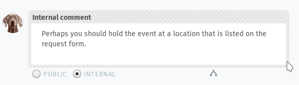
The first change would be to add a visible label of “Internal” to internal discussion bubbles, and change the outline color to gray.
The second change would be to replace the toggling icon with either a toggle switch that shows the state, or a pair of radio buttons.
Another option would be to use multiple symbols, to make it clear that the left control is a verb, not an adjective, and to contrast locked with world-visible:
(Add border to show that all three are part of one button, perhaps?)
The least change at all would be to at least alter the icon so that locked and unlocked are clearly visually distinguishable:
I just came across this looking for an answer to the question “what do the locks mean on zammad note”, so I wanted to leave a message saying the suggestions seem really good - I didn’t find it particularlly clear at all that a note with a red border was private, nor that the unlock icon meant ‘click this to share it publicly’.

 )
)