Text formatting answers in the knowledge base doesn't work as expected

*Used Zammad version: 3.2.0-1578664361.375c4929
*Used Zammad installation source: Debian Package
*Operating system: Ubuntu 18.04
*Browser + version: Firefox 72.0.1

Expected behavior:

Actual behavior:

  • The shortcut for headings is actually ctrl+SHIFT+

Steps to reproduce the behavior:

  • Type some text in an answer
  • Attempt to change to H1 by pressing ctrl+alt+1
    *nothing happens (on my setup)

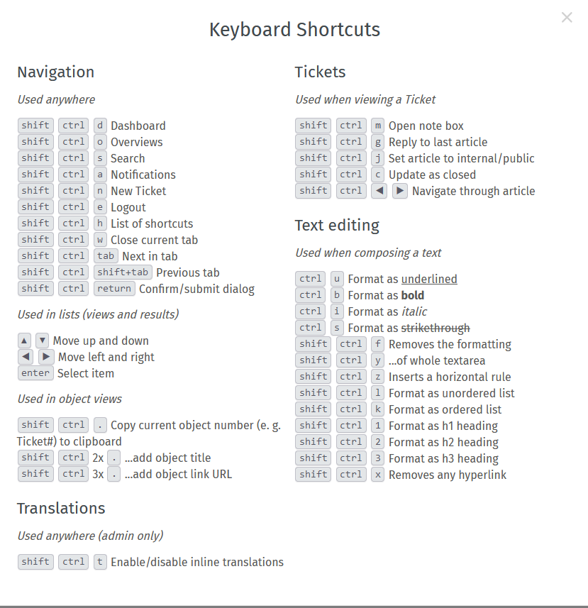
You can find the current keyboard shortcuts by opening your profile on the bottom left on the screen and clicking on keyboard shortcuts. There it says correctly that it’s Ctrl+Shift+1 etc.

1 Like

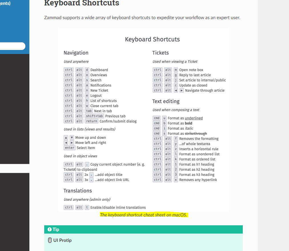
The screenshot shows shortcuts for macos as the title below states.
Is that not straight forward? If not, how could we improve that page to make it clearer?

Thanks MrGeneration.

The confusion is that the Zammad documentation show different shortcuts to that shown in the zammad UI:

https://user-docs.zammad.org/en/latest/advanced/keyboard-shortcuts.html

Notice for 'H1, H2…) the doc says ‘shift, alt…’ and the UI help says ‘shift, ctrl…’. No biggie, it works with with the shortcuts stated in the UI

Yes I got that.
The point is, the also state that the above examples are for Mac OS:

As this is an example of one os how it can looks, my question is how we can enhance this to not further confuse people?

Read blicking “warning: might differ from your OS” ?
I mean don’t get me wrong, I really want to enhance it if we can - I just don’t know what would enhance it.

Before you ask: No it is not possible to make the documentation detect the OS and thus swap images. :wink:

@MrGeneration maybe two different examples would make it clear?
This screenshot (very ugly version :sweat_smile:) shows what I mean:

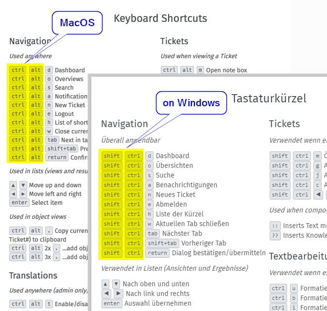
I have been fiddling around and personally think that if you really have to put more than one keyboard shortcut example, it should be kinda dashed like below:

However, I don’t have all required operating systems to work this out in a way I’m happy with it.
The above way is ugly and I’d prefer to remove the whole image instead of making it that way.

Personally I also think that the hint on how to get the correct shortcuts for your system should be enough:

Another option would be to put them side to side - however, again, quality differs between the screenshots which is why I didn’t find a good way to solve this.

Sorry.

Hey @MrGeneration thanks for following up on this one… I didn’t actually notice the !!highlighted!! text in the documentation

For me @awedor’s suggestion works fine, it’s actually easier to refer to the shortcut in the UI & they’re correct for me

This topic was automatically closed 120 days after the last reply. New replies are no longer allowed.