Infos:
- Used Zammad version: 5.0
- Used Zammad installation type: (source, package, docker-compose, …) package
- Operating system: Ubuntu 20
- MariadDB
- Apache2
- Browser + version: Firefox version 101
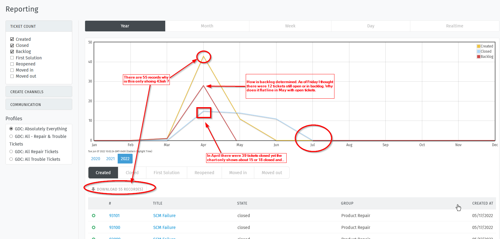
I’m looking at the reporting graph (see attached image) and I’m wondering what the numbers mean. I created a report that shows tickets in all states (Closed, Merged, New, Open, Pending Closed, Pending Reminder). I see that this gives me a potential of 55 records for extract to excel.
The Graph only shows a total of 43 CREATED tickets (Not the 55 records that are available for download).
The graph shows that there are about 18 tickets closed in Apr but if I download the data to excel and count the closed tickets in April there are actually 39 tickets closed. Also why does the closed tickets extend out to July (we are only in June).
The graph also shows a backlog of roughly 28 tickets. When I count what I believe to be the backlog I come up with 12 tickets - maybe the better question is what constitutes a backlog.
I looked at both the user docs and the admin docs to try to get a handle on what this graph is showing us but I didn’t find much.
Management is asking how does one read the graph and what does it mean.Any help in understanding the graph is highly appreciated.