Sometimes our tickets are monitored by several agents. Internal customer collegues and external users are also notified. Zammad keeps a record of all email notifications for every commentary in the main ticket view. That is helpfull on the one hand side. But it completely clutters the screen if too many users are included in the ticket.
Infos:
- Used Zammad version: 6.2
- Used Zammad installation type: package
- Operating system: Debian 12 (self-hosted), Windows10 (Client)
- Browser + version: Firefox 115.8.0esr
Expected behavior:
It would be very nice if the ticket screen notifications about sent emails were displayed in the same way as the “popover” information about customers and agents: You touch some element with your mouse and get a nice popover box with the informations about sent emails (with dark/bright theme integration).
My Problem: I am stuck with adopting the “touch-manipulation” action that is indicated in the CSS oft the beautiful popover resulting from a touch of the agent/customer icons in the ticket view.
Actual behavior:
-
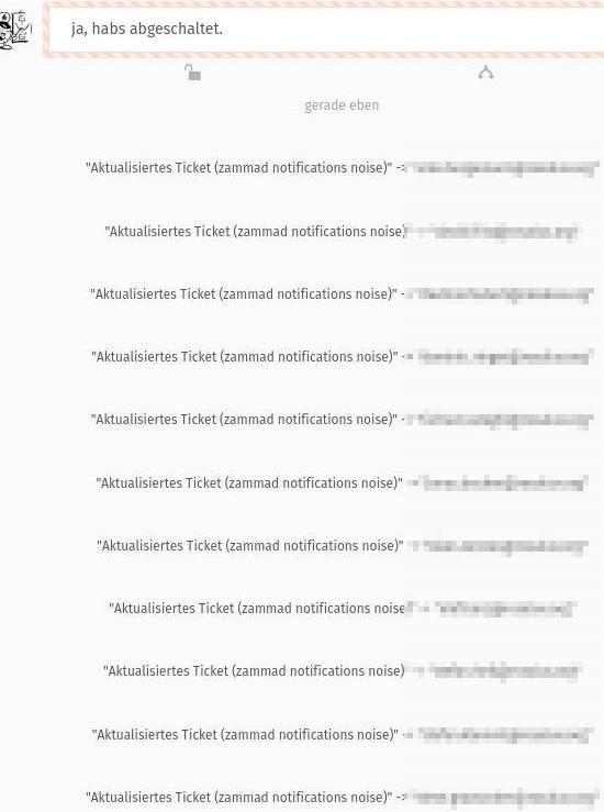
in the fresh install it looked like this (and took way too much space on the main ticket view):
-
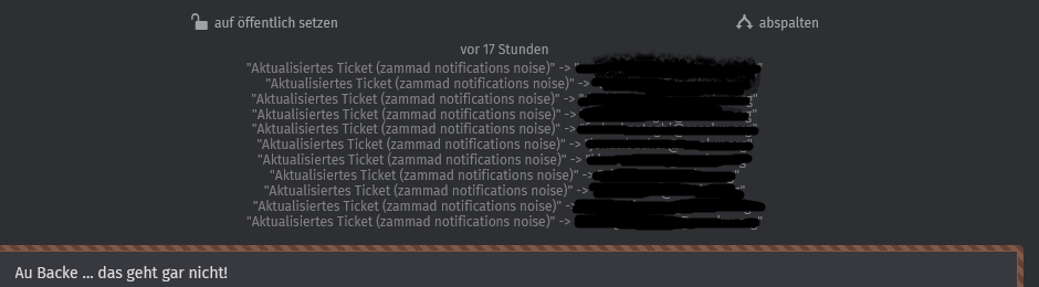
my custom CSS (see below under “Steps to reproduce”) completely hides the notes (which is OK).
They pop into the screen on hover/mouseover over each commentary (.ticket-article-item). They do not “popover” but push the following content down (which is not OK: all the ups and downs in the ticket content drive our agents crazy).
But it is better than before as it doesn’t waste so much space any more. It looks like this:
Steps to reproduce the behavior:
Add the custom CSS to the system:
- Create
/opt/zammad/app/assets/stylesheets/custom/notifications.css - Add CSS:
.ticket-article-item {
padding-bottom: 0px;
}

.ticket-article-item .task-subline {
margin-top: 2px;
}

.article-content {
margin-top: 20px;
}

.ticket-article-item.system {
 display: none;
}

.ticket-article-item:hover ~ .ticket-article-item.system {
/*  display: inline-flex; */
 display: block;
 color: grey;
 line-height: 1;
 padding-bottom: 0;
}
- Owner and permissions caveats are treated in “Custom CSS foes”.
- Precompile with
zammad run rake assets:precompile - Restart with
systemctl restart zammad-web