I just saw the video of That Helpdesk Guy about the preview of the new desktop view of Zammad. Is it too early in this stage of development to discuss it or is this the right place and time?
First I want to say that I think it’s a great step forward. While the current GUI is already very modern, the new one is a huge step forward. It features multiple tabs, an RTF editor with Markdown and table support, automatic reloading of additional rows in lists, and much more.
Here’s a small thing I’ve noticed so far:
Email isn’t displayed if the option Setting.set(‘ui_user_organization_selector_with_email’, true) is set.
Congratulations! You found your way into a construction site. This is a glimpse of what Zammad’s new UI will bring to you soon™. Please be aware that this is not production ready yet!
There is a limited chance of data loss, if you continue to use it. If you want to wander around, feel invited to do so in a test environment.
Once we feel that this new UI is ready to receive feedback we will start the communication in our community forum. But for now, this is an early stage and we are not ready for that yet. Please be patient. If you want to, be excited. - We definitely are!
There is a lot of details missing in it’s current state, and other stuff may get a complete rework. If you dare to run an instance on the develop-branch and keep that updated you will see, that almost weekly, there are minor and major changes in the commits around it.
Once we are ready for feedback, there will be some type of Beta phase, where you will be able to toggle between old and new UI. But we don’t have a timeline for that yet, as we are easily distracted by other fancy stuff as well. E.g. new AI features
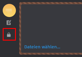
A simple and well explained popup alt text caption on mouse hover over for all the different and less intuitive icons would benefit all people. Any possibility to change alt text explanation depending on icon image state?
Requiring two or more clicks when one click is easier and faster helps very few people.
I think it’s also not that we can not add any tooltip.
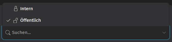
But the complete structure of the article reply form was changed to make it better “accessible” in the desktop view.
We will definitely have an eye on the private/public switch, and if we receive more problems that it will now require one additional click. We always have the option to align the Form-Element in a different direction.