I have a weird use case that involves running a primarily email based support desk during my organization’s annual convention. The folks who staff that support desk are all volunteers and most don’t have existing support experience. Zammad is mostly great for this but the notes field consistently trips up some of the volunteers. I’ve been messing around with possible solutions and wanted to share the CSS nonsense I created in case it’s useful for anyone else in a similar situation:
/* Hide the notes field on tickets /*
/* Note: This will also hide new emails that have been set to private */
form.article-add.is-internal {
    opacity: 0;
}

/* Show notes field on mouse over */
form.article-add.is-internal:hover {
    opacity: 100;
}

/* Make ticket actions larger and more visible */
a.article-action.js-ArticleAction.u-clickable {
    color: #545454;
    font-size: 14px;
    background: white;
    text-align: center;
    vertical-align: middle;
    border-radius: 4px;
    margin-top: 7px;
    border: 1px solid rgba(0, 0, 0, 0.1);
}

/* Tweak action icons for larger text */
.article-action-icon {
    margin-right: 5px;
    vertical-align: middle;
    width: 17px;
    height: 17px;
    fill: currentColor;
}

/* The lock icons align differently than the other action icons */
.icon-lock-open {
    vertical-align: top !important;
}
.icon-lock {
    vertical-align: top !important;
}
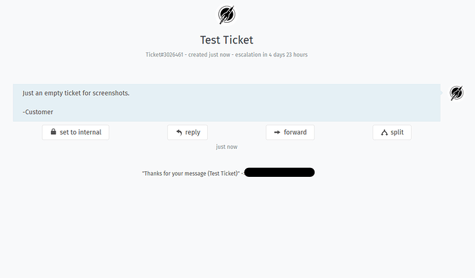
The end result hopefully will be a little more newbie friendly without the distracting notes input box and with more obvious ticket actions:
If a more experienced agent wants to use notes they can still hover over the hidden notes field or they can override the CSS with an browser extension like Stylish.
