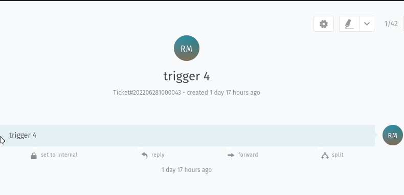
i have used css to make the action buttons under article a bit alive. maybe someone likes and would like to have these.
#: /opt/zammad/app/assets/javascripts/app/views/ticket_zoom/article_view_actions.jst.eco


<div class="article-content article-actions horizontal">
  <% for action in @actions: %>
    <a href="<%= action.href %>" style="--clr:#1e9bff" data-type="<%= action.type %>" class="article-action js-ArticleAction u-clickable<% if action.class: %> <%= action.class %><% end %>">
      <%- @Icon(action.icon, 'article-action-icon') %><span class="article-action-name"><%- @T(action.name) %></span><i class="article-action-name-i"></i>
    </a>
  <% end %>
</div>
Custom CSS:
#:/ /opt/zammad/app/assets/stylesheets/custom/custom.css

a.article-action.js-ArticleAction.u-clickable {

    position: relative;
    color: #8a9193;
    text-decoration: none;
    letter-spacing: 0.05em;
    padding: 5px 15px 4px 15px;
    transition: 0.5s;
    font-size: 10px;
    background: #f8f9fa;

    /* When enabled, letters are written in capital letters
    text-transform: uppercase;
    */
}

a.article-action.js-ArticleAction.u-clickable:hover {
    letter-spacing: 0.25em;
    background: var(--clr);
    color: var(--clr);
    box-shadow: 0 0 35px var(--clr);
}

a.article-action.js-ArticleAction.u-clickable::before {
    content: '';
    position: absolute;
    inset: 2px;
    background: #f8f9fa;
}

span.article-action-name {

	position: relative;
	z-index: 1;
}

svg.article-action-icon {
	position: relative;
        z-index: 1;
}

i.article-action-name-i {
	position: absolute;
	inset: 0px;
	display: block;
}

i.article-action-name-i::before {

	content: '';
	position: absolute;
	bottom: -3.5px;
	left: 80%;
	width: 10px;
	height: 5px;
	border: 2px solid #f8f9fa;
	backgroud: #fff;
	transform: translateX(-50%);
	transition: 0.5s;
}

a:hover i::before {

	width: 20px;
	left: 20%;
}

i.article-action-name-i::after {

        content: '';
        position: absolute;
        top: -3.5px;
        left: 20%;
        width: 10px;
        height: 5px;
        border: 2px solid #fff;
        backgroud: #27282c;
	transform: translateX(-50%);
        transition: 0.5s;
}

a:hover i::after {

        width: 20px;
        left: 80%;
}
 maybe we will have a dark mode in 5.3 then it would look even better^^